Chart Prompts
1,337 ways to dress a line or bar chart, 669 light and 668 dark. Open any chart to see it full size and copy a prompt that gives your own chart the same look.
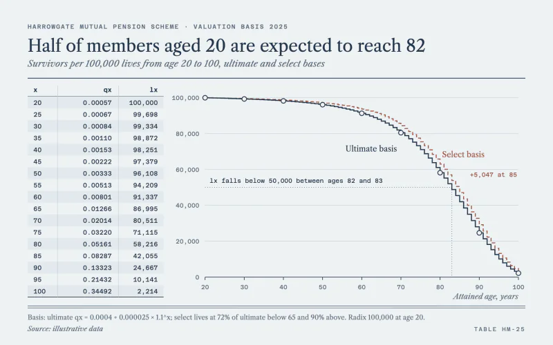 Mortality TableLedger-stock life table beside a thin navy step survival curve.
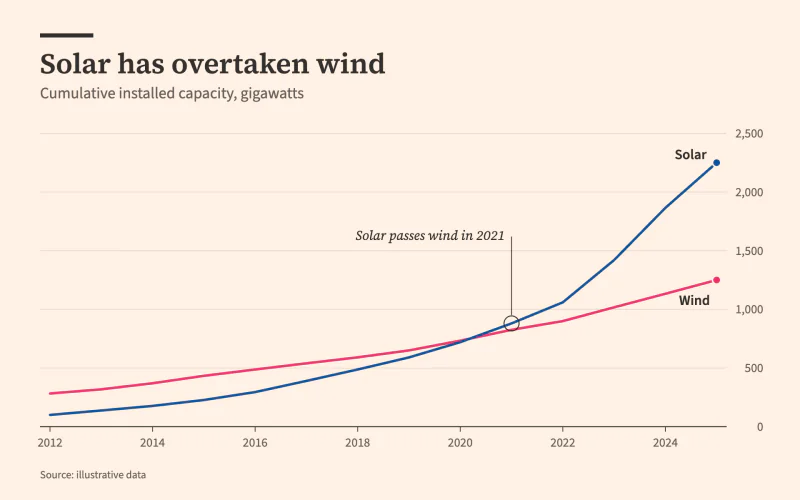 BroadsheetSalmon newsprint, a serif headline and labels set right on the lines.
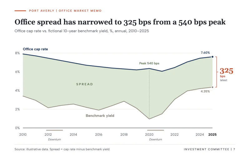 Cap Rate SpreadInvestment memo with navy and gray lines, a sage spread fill and a bps bracket.
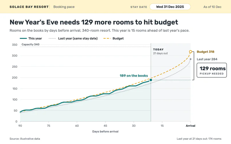 Pickup ReportA booking-pace screen that counts down to arrival and boxes the pickup still needed.
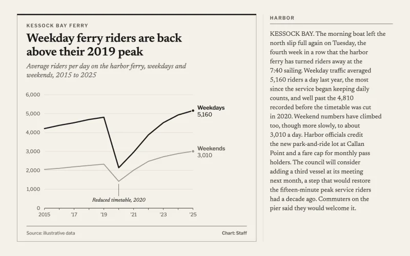 Column InsetA narrow newsprint inset box in gray-black ink, set into a column of copy.
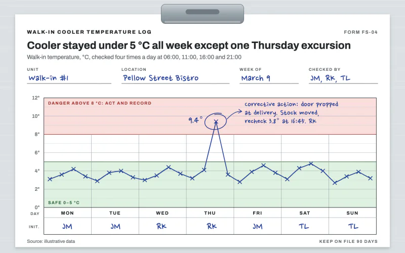 Cooler LogClipboard food safety log with safe and danger bands and a blue ballpoint line.
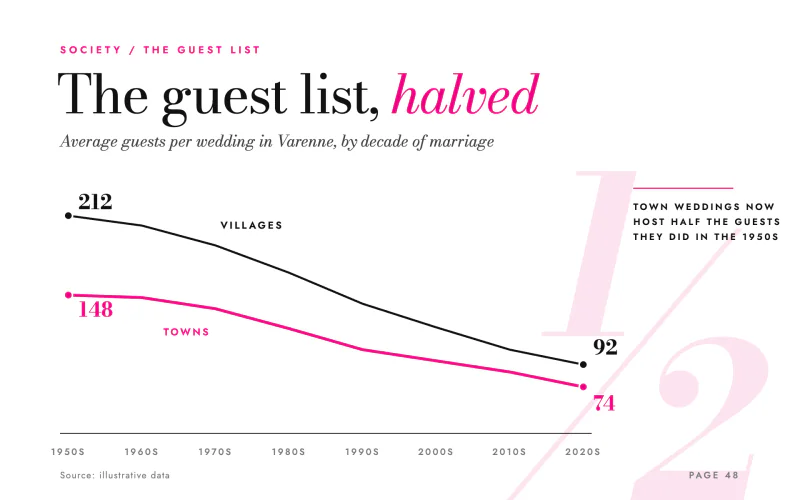 Glossy FeatureGiant roman-and-italic serif headline, hot magenta line and a bleeding pull numeral.
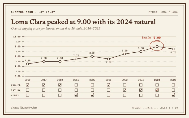 Cupping FormA cream cupping card with a quarter-point score ruler and a red pencil circle.
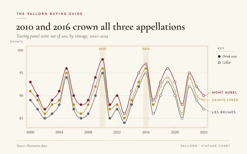 Vintage ScoresA wine merchant's vintage chart with filled markers for wines ready to drink.
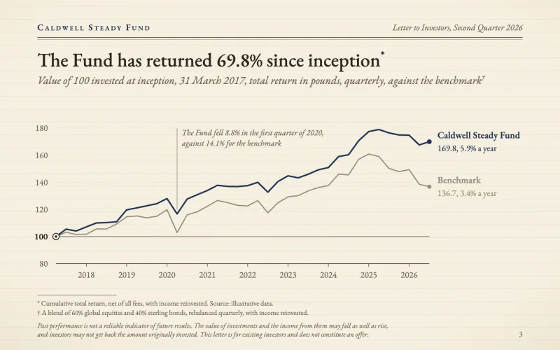 Quarterly LetterA fund letter on cream laid paper, rebased index lines and footnoted small print.
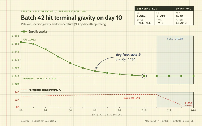 Gravity LogA brewer's log on yellow graph paper with square markers and a pencilled note.
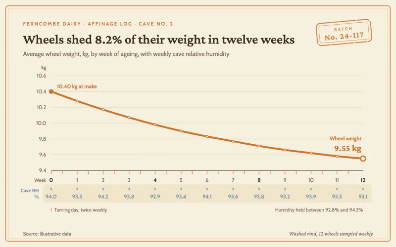 Cheese CaveA cream affinage log with a thick rind-orange line, dual axes and a batch stamp.
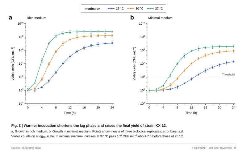 Preprint FigureA two-panel journal figure with log axes, marker-coded series and a Fig. 3 caption.
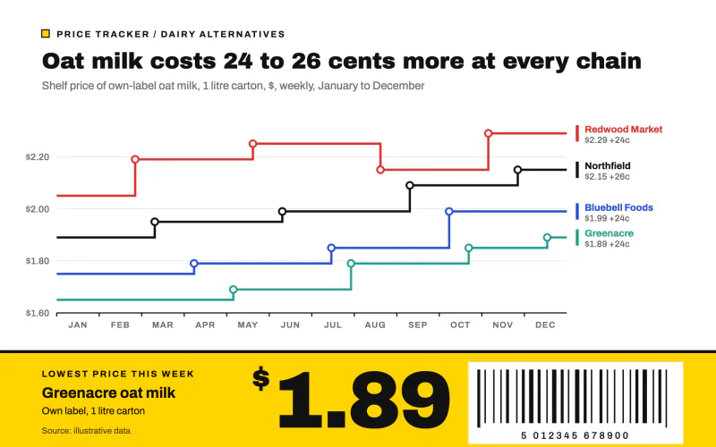 Shelf EdgeStepped price lines over a yellow shelf-edge label with a huge price and barcode.
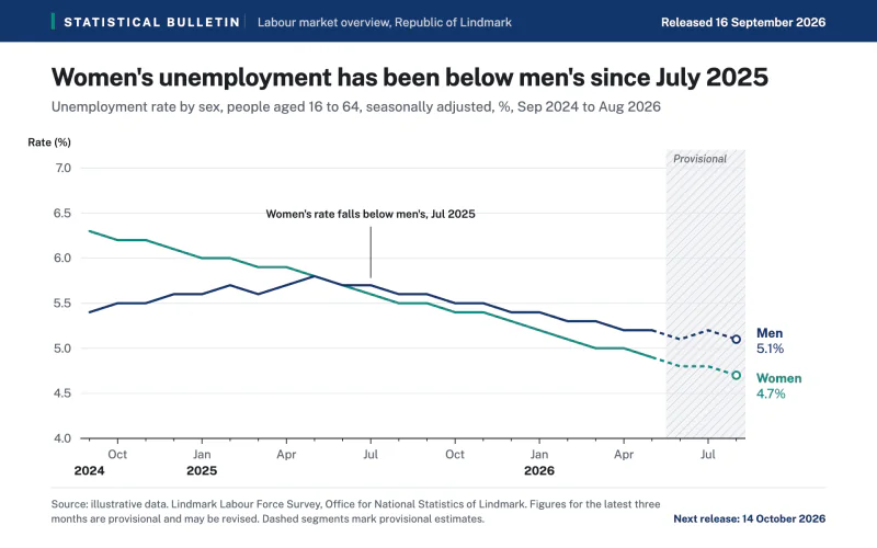 Statistical BulletinAn official statistics release with a navy header and a hatched provisional zone.
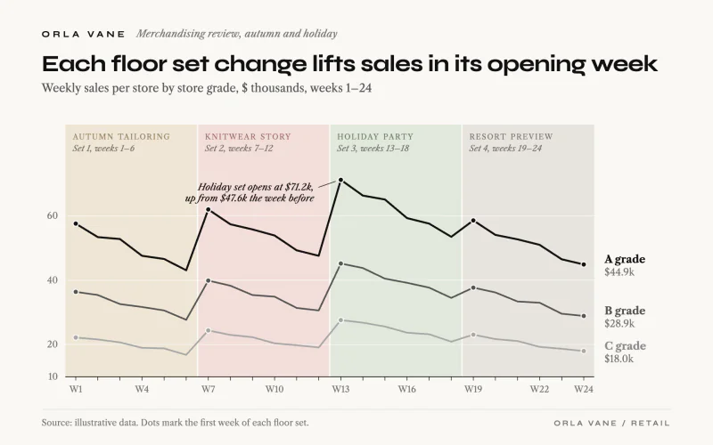 Floor SetGrayscale store-grade lines over pale floor set bands named in small caps.
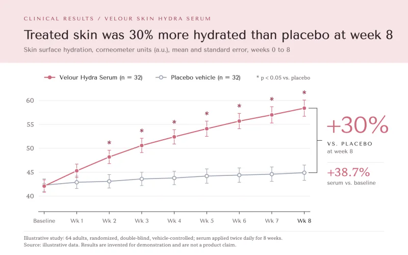 Skin StudyClinical claims page: pink header band, rose vs gray trial lines and a week-8 bracket.
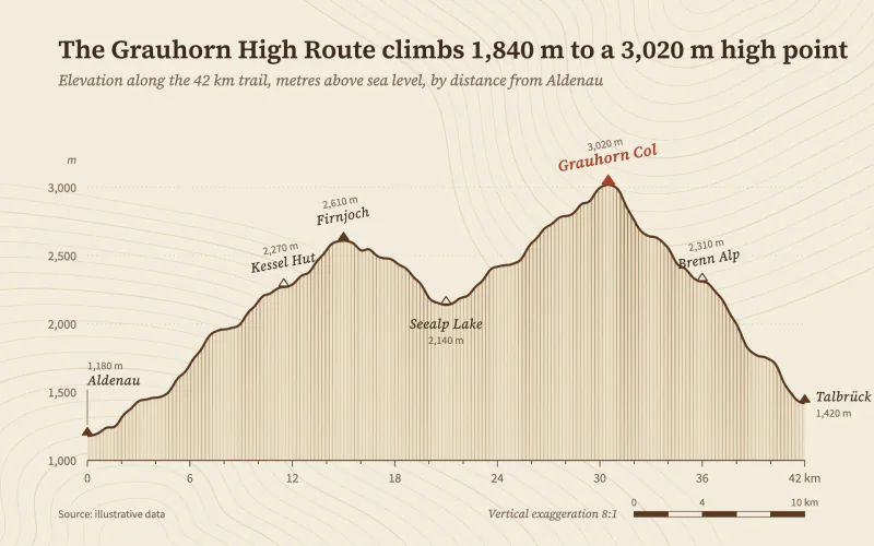 Elevation ProfileBuff survey paper, a hachured trail profile and angled map lettering.
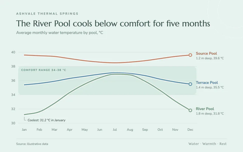 Thermal SpringsAiry seafoam spa brochure with rounded haloed lines over a soft comfort band.
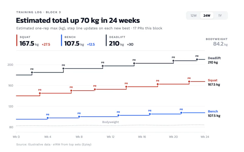 Strength LogWhite training-app step lines in brick, blue and graphite with tiny PR badges.
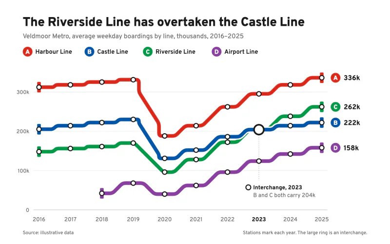 Metro LinesTransit-map routes that bend only at 45 degrees, with station and interchange markers.
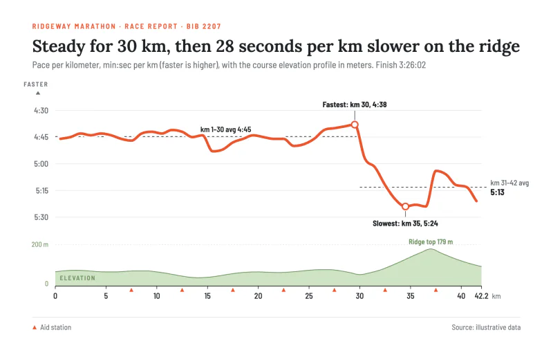 Race PaceA thick coral pace line on an inverted axis over a pale green elevation strip.
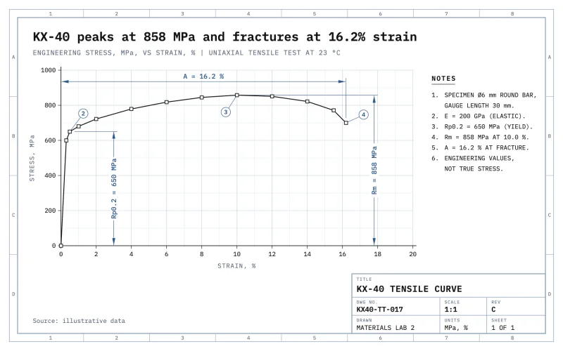 WhiteprintA white CAD plot sheet with dimension lines, balloons and a ruled title block.
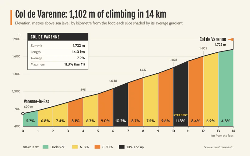 Climb GradientRace-guide climb profile cut into km slices shaded by gradient.
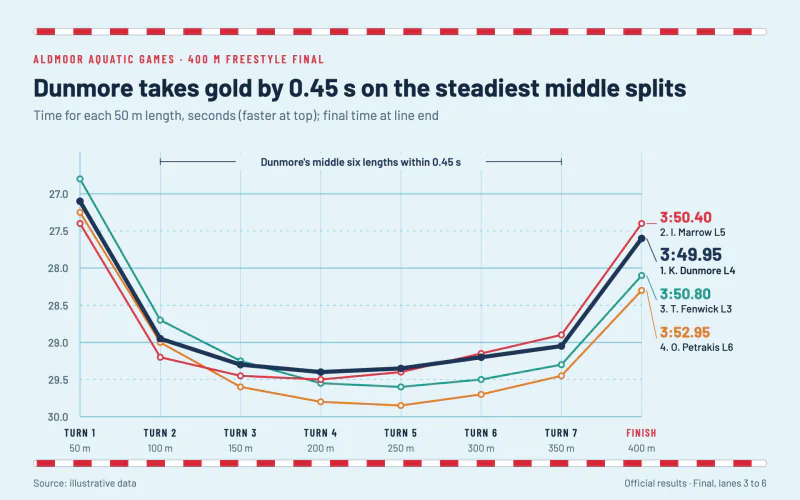 Lane SplitsPool-blue results sheet with lane-rope rules and a thick winner's line.
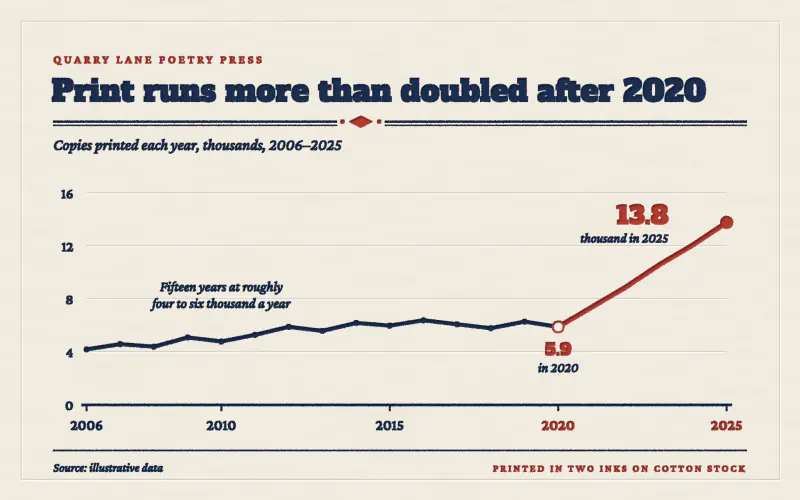 LetterpressTwo inks pressed deep into cotton stock, with blind-debossed gridlines.
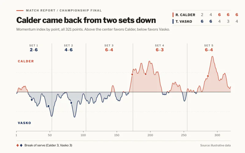 Match MomentumChalk-white match report where a momentum line swings between two players.
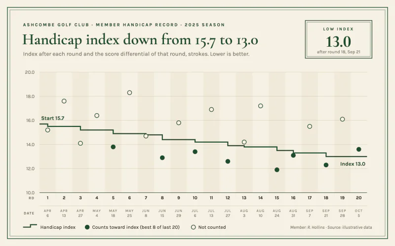 Handicap CardCream scorecard stock, double green keylines, a step line and a boxed low index.
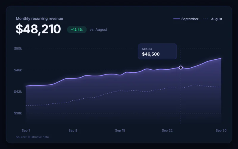 Midnight GlowA dark dashboard card with a hero metric and a glowing gradient area.
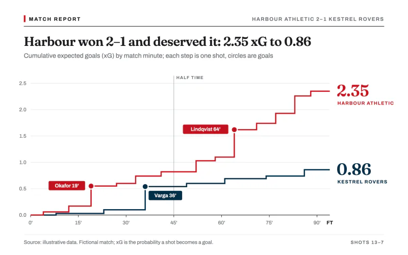 xG RaceWhite match report with crimson and navy xG step lines and tagged goal dots.
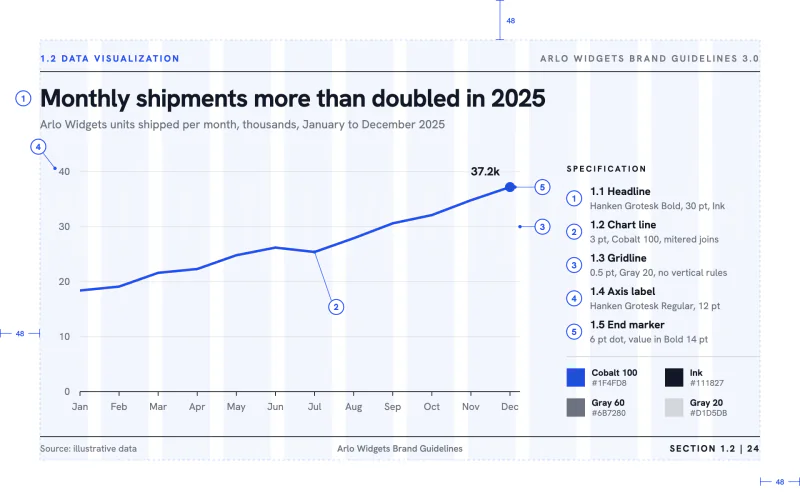 Brand ManualAn identity-guidelines spec page with a layout grid and numbered callouts.
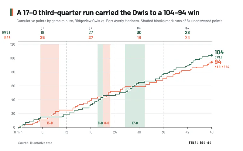 Game FlowBox-score step lines of cumulative points with tinted blocks behind scoring runs.
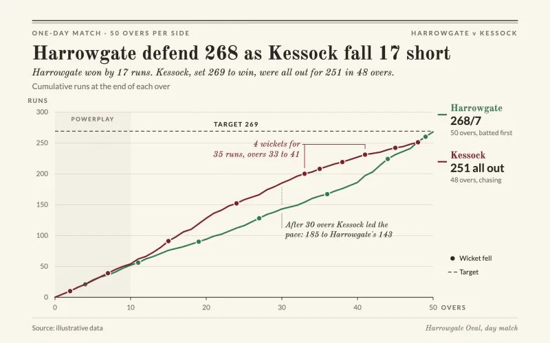 Run WormCream scorecard worm with wicket dots, a dashed target and an italic result line.
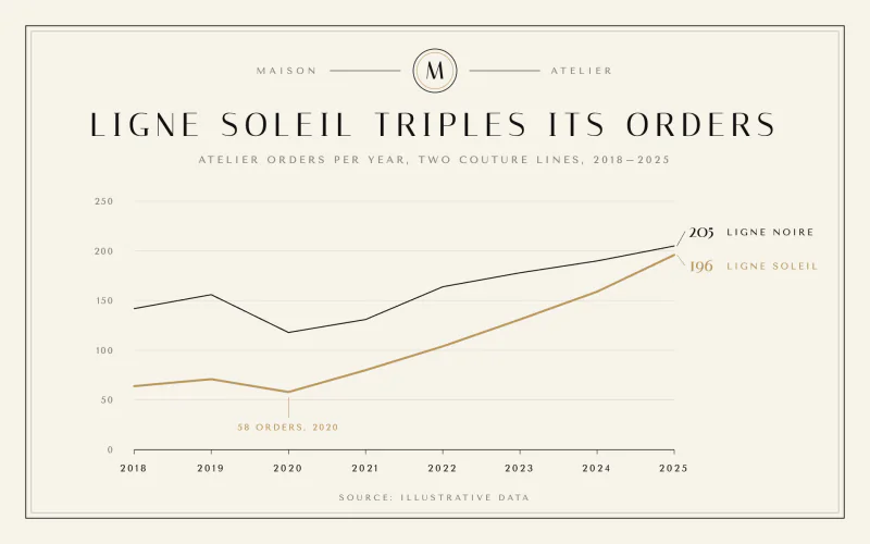 MaisonCouture lookbook calm with ivory, a hairline frame, a monogram and two fine lines.
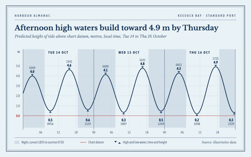 Tide CurveHarbour almanac page with a navy tide curve, night bands and timed highs and lows.
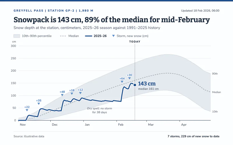 SnowpackThis season's snow depth in deep blue over a pale historical percentile band.
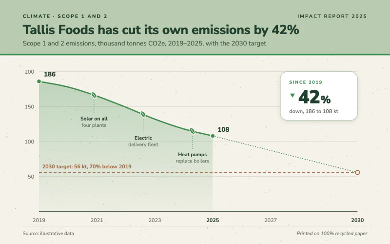 Impact ReportRecycled-paper sustainability spread with a sage band, leaf milestones and a stat card.
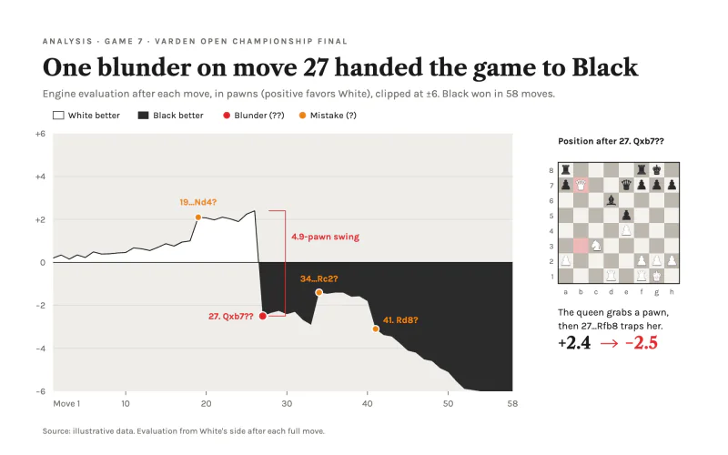 Engine EvalAnalysis board page where white and charcoal fills split the advantage at zero.
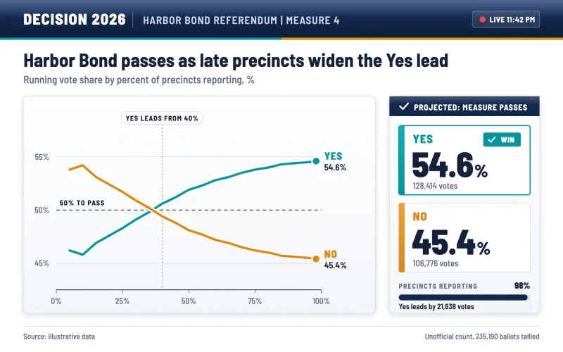 Election NightA white results board with a navy header, teal and amber options and a result lockup.
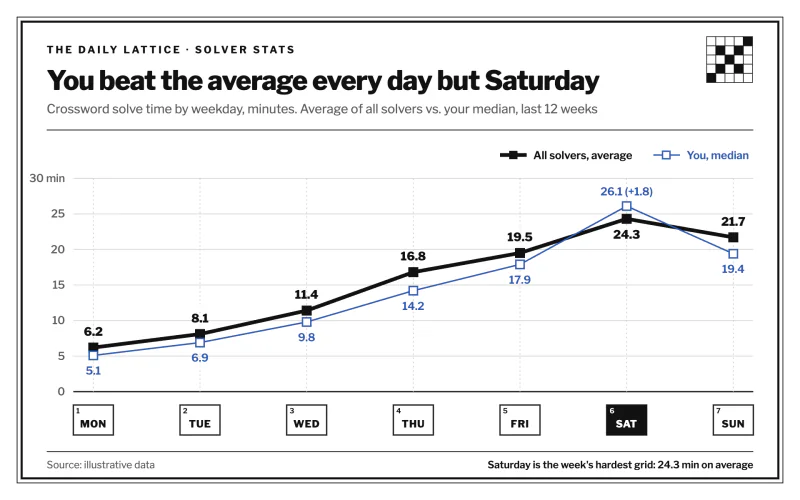 Solve TimesNewspaper puzzle corner with a heavy black line and crossword-cell axis labels.
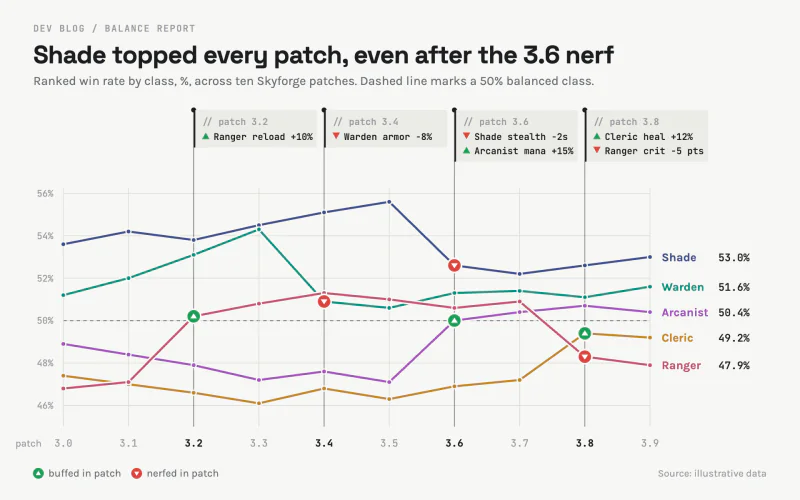 Patch NotesA dev blog balance chart with changelog tags hung from each patch like code comments.
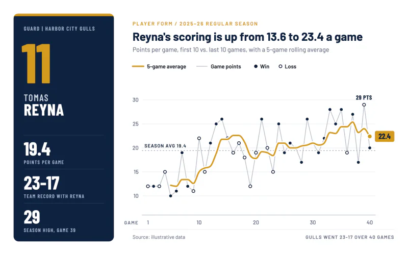 Season FormA navy player card and a gold rolling average over game-by-game dots.
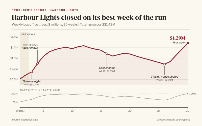 Show RunIvory producer's report with a thick red run line and hanging italic milestones.
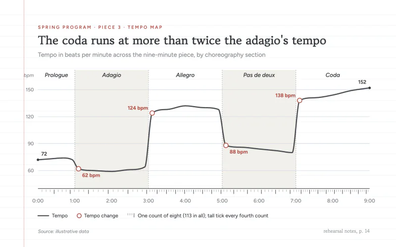 Tempo MapA graphite tempo line on a ruled choreography notebook page with count ticks.
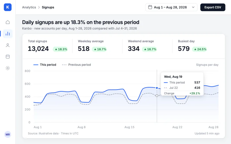 Admin PanelA back-office card with nav rail, KPI pills and a pinned crosshair tooltip.
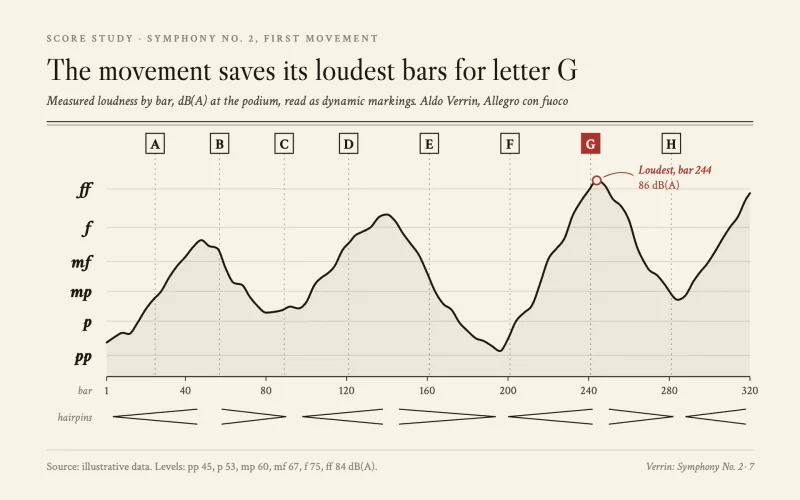 Dynamics CurveA score study page with dynamic markings for a y axis, hairpins and rehearsal letters.
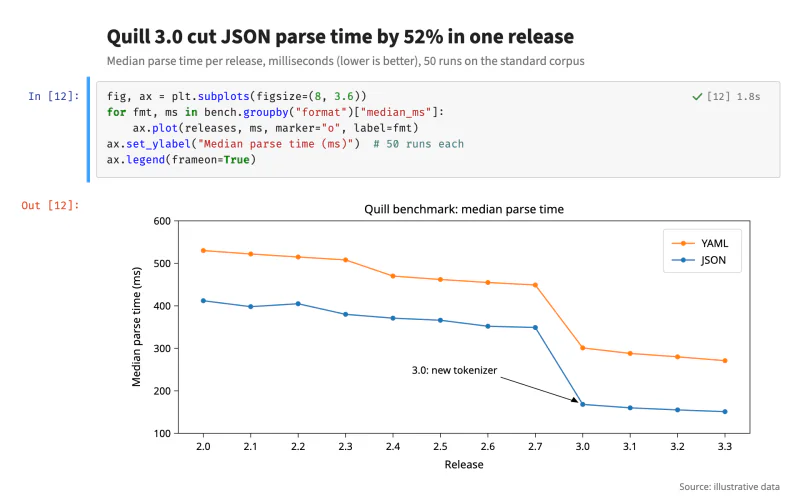 Notebook CellA notebook code cell with In and Out prompts above a plain boxed scientific plot.
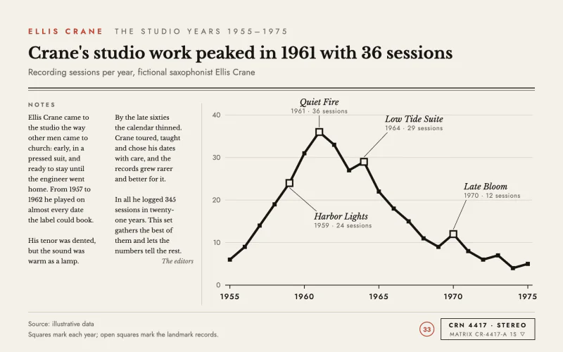 Liner NotesLP back cover with serif liner notes, a heavy black line and square markers.