Papers
Topics
Authors
Recent
Search
2000 character limit reached

Observable Matrix Dynamics of Stocks

Published 21 Jul 2026 in q-fin.ST, cs.CE, q-fin.GN, and q-fin.PM | (2607.19005v2)

Abstract: The Observable Matrix Dynamics (OMD) approach monitors the time development of complex non-linear systems through the trajectory of a fixed-size distance matrix and its spectrum. We apply it to the S&P 500 cross section over three crisis decades, the 2001 dot-com bust, the 2007--2008 financial crisis, and the 2020 Covid crash, with three fixed-size observables on a fixed universe. The arccos distance matrix of the rolling return correlations reads the correlation geometry: its effective dimension collapses at the 2008 and 2020 crises, while the 2001 bust is a dispersed unwind. Read against machine-learning distance matrices, its spectrum stays in the un-relaxed, pre-learning regime with no low-dimensional manifold, so the market never learns its correlation structure or relaxes to a stationary geometry. Subtracting the market factor exposes a coherent sector rotation, whose name-level attribution identifies which stocks drive each crisis and in what order. At a short lookback these signals resolve precursors and forecast the endogenous 2008 crisis, though not the exogenous 2020 shock. The other two observables model the daily return and volatility rankings as Markov chains on their ranking spaces. The return chain has persistent, defensive-led bellwethers and near-reversible dynamics. The volatility chain is far more persistent, led by the financial sector, and is the only one to carry a weak, episodic arrow of time, flaring at market stress and matching volatility clustering and the Zumbach effect. All three matrices show coherent changes during market crashes.
Authors (1)

Summary

  • The paper applies a novel observable matrix dynamics framework to reveal high-dimensional, non-equilibrium market behavior across crises.
  • It leverages rolling return correlations and ranking-based Markov chains to extract spectral, geometric, and dynamical diagnostics of market turbulence.
  • Findings highlight persistent market structure, absence of low-dimensional collapse, and coherent sectoral rotations during major financial crises.

Observable Matrix Dynamics of Stocks: An Authoritative Technical Analysis

Overview and Methodology

"Observable Matrix Dynamics of Stocks" (2607.19005) applies the Observable Matrix Dynamics (OMD) paradigm to the cross-sectional analysis of the S&P 500 over three crises: the 2001 dot-com bust, the 2007–2008 financial crisis, and the 2020 Covid crash. The methodological innovation is to reduce the complex non-linear system of stock returns to a trajectory of three fixed-size matrix observables: the arccos distance matrix built from rolling return correlations, and two Markov transition matrices defined by return and volatility rankings, respectively.

The OMD framework, building on tools from random matrix theory (RMT) and Euclidean random matrices [bogomolny2003, halperin2026omd], is leveraged to extract spectral, geometric, and dynamical diagnostics rather than relying solely on scalar summaries of correlation matrices. The key insight is that a market’s high-dimensional geometry, encoded in the distance matrix, does not relax or settle into a stationary manifold, in contrast to the learning trajectories of neural networks. This persistent non-equilibrium is quantified through the spectral properties of the trajectory, sectoral decompositions, and entropy-based measures of disequilibrium and time-irreversibility.

Distance Matrix and Spectral Diagnostics

The central observable is the arccos distance matrix Mij=arccos(Cij)M_{ij} = \arccos(C_{ij}) of rolling correlations, interpreted via the Bogomolny–Bohigas–Schmit (BBS) random distance matrix framework. Key spectral diagnostics extracted include:

  • The Perron eigenvalue Λ1\Lambda_1: scales with average angular separation in returns.
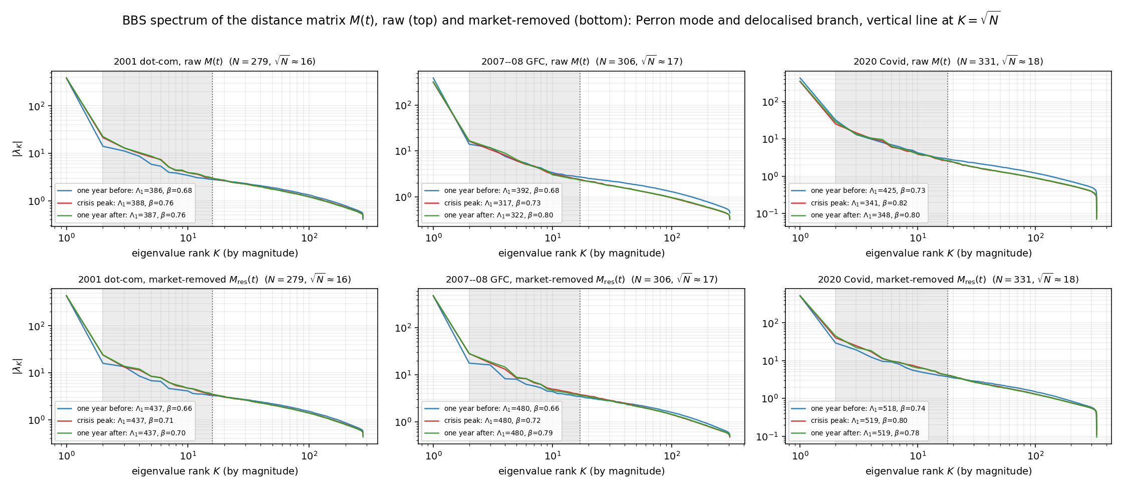
  • The delocalized exponent β\beta, read from the decay λKKβ|\lambda_K| \sim K^{-\beta} of ranked eigenvalues: in principle encoding an effective latent dimension.

In all three crises, the empirical spectra fundamentally deviate from the equilibrium predictions of BBS and the relaxation seen in learned neural representations:

  • The market spectrum never displays low-dimensional manifold structure or shoulder/multiplet features, and β\beta remains in the unrelaxed regime (β0.7)(\beta \lesssim 0.7) throughout.
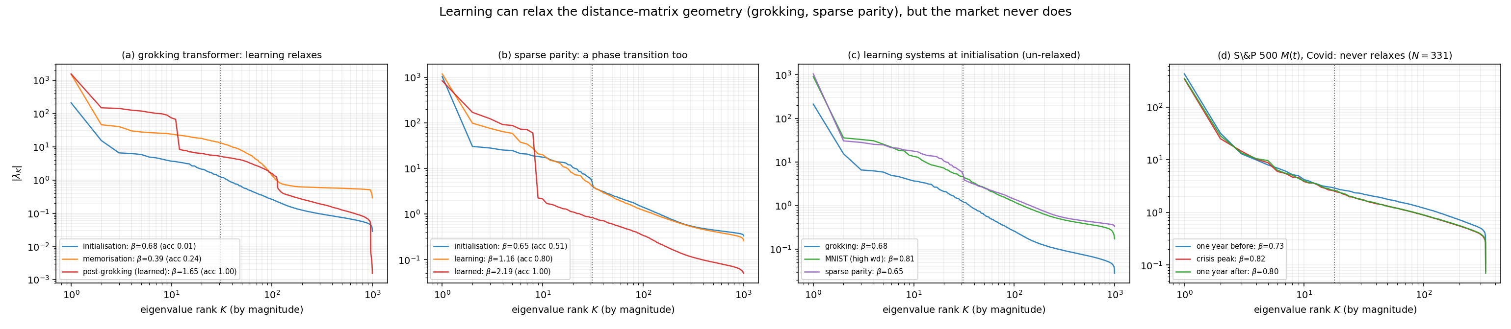
  • Relaxation phase transitions, analogues of “grokking” in machine learning, are absent. The market factor dominates, but both pre- and post-deflation spectra lack the geometric hallmarks of learning-induced dimensional collapse. Figure 1

    Figure 1: BBS spectrum of the distance matrix M(t)M(t), showing persistent unrelaxed, high-dimensional behavior across three crises and under market-factor removal.

Additionally, contrasting these dynamics with learning systems (e.g., transformers or MNIST experiments) shows that only trained, relaxed systems acquire structured, low-dimensional geometry detectable via β>1\beta > 1 and multiplet shoulders. The equity market does not. Figure 2

Figure 2: Spectral evolution in learning systems (grokking, MNIST) displays phase transitions absent from real market distance matrices.

Crisis Diagnostics: Dimensional Collapse and Sector Geometry

The onset of major crises is marked by sharp spectral changes:

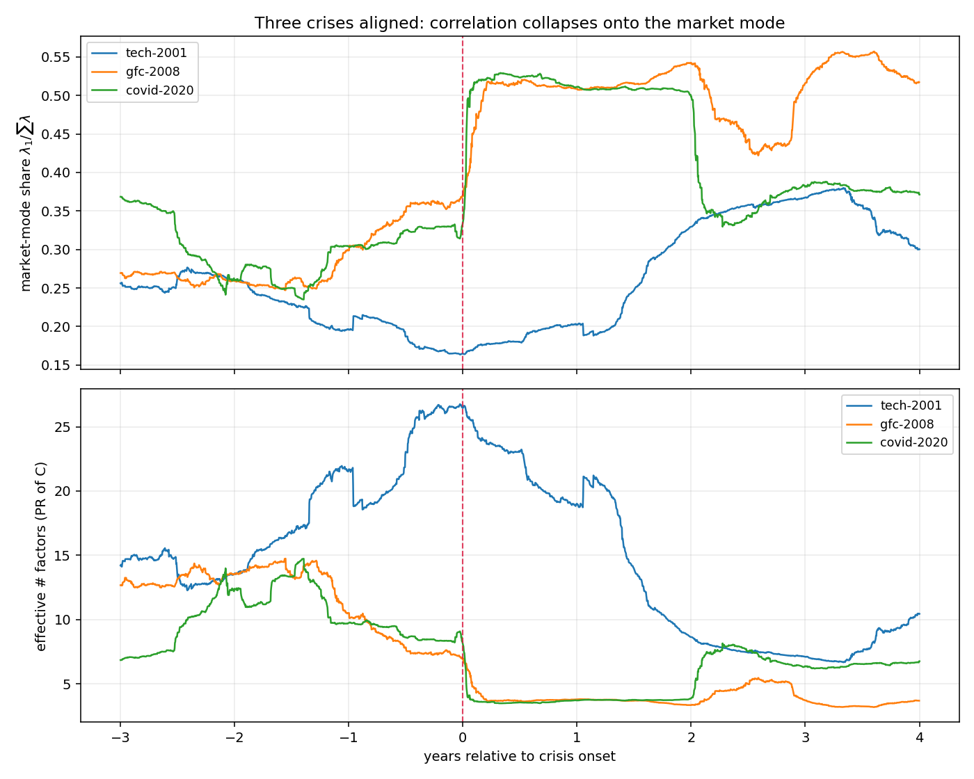
  • 2008 and 2020 crises display collapses in effective factor count (participation ratio) and rises in the market-factor share.
  • The 2001 dot-com bust is orthogonal, with increased dispersion and decorrelation among technology names.

A crucial novelty arises when market-factor removal is performed:

  • Post-deflation, sector geometry (notably utilities, technology, energy, financials) exhibits coherent rotations, captured quantitatively by projector drift and commutator diagnostics, distinguishing genuine rotation from simple eigenvalue growth. Figure 3

    Figure 3: Market-factor share and effective factor count evolution, highlighting sharp contraction at crisis onsets for 2008/2020 versus dispersion for 2001.

    Figure 4

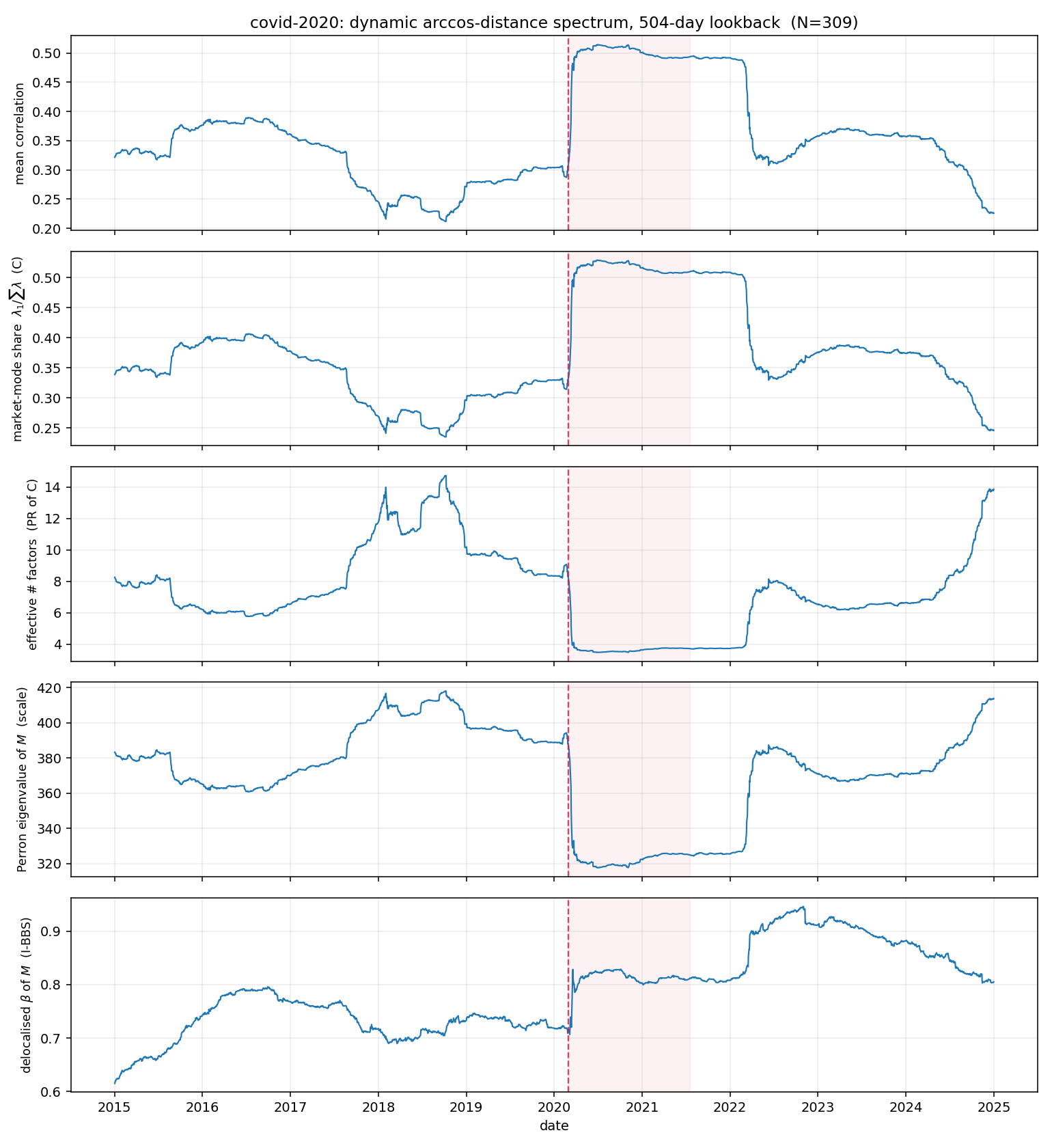
    Figure 4: Covid period, showing trajectories of mean correlation, market share, effective factors, and geometric diagnostics.

    Figure 5

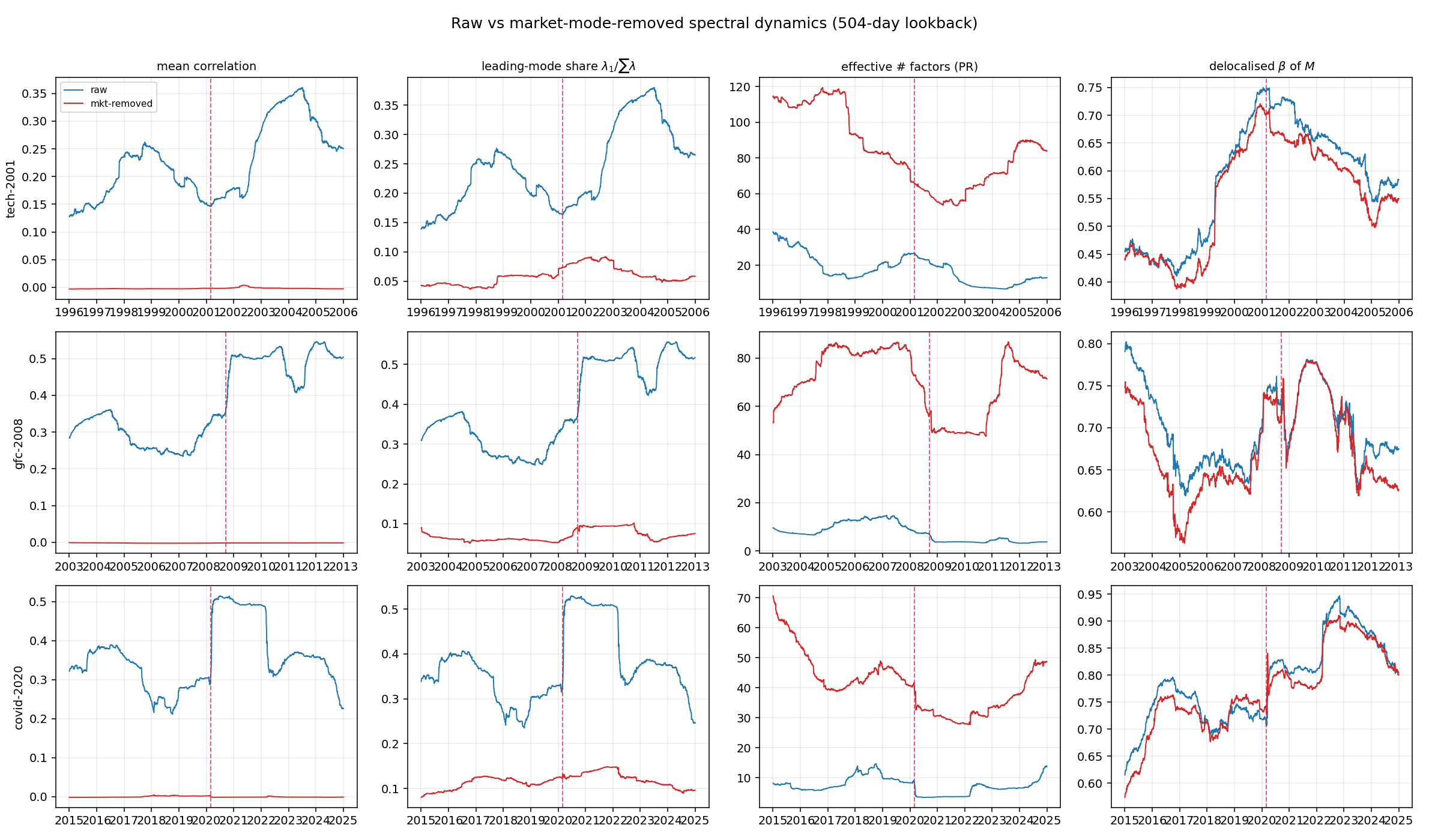
    Figure 5: Comparison of raw and market-factor-removed spectral dynamics reveals sectoral reorganization on independent timescales.

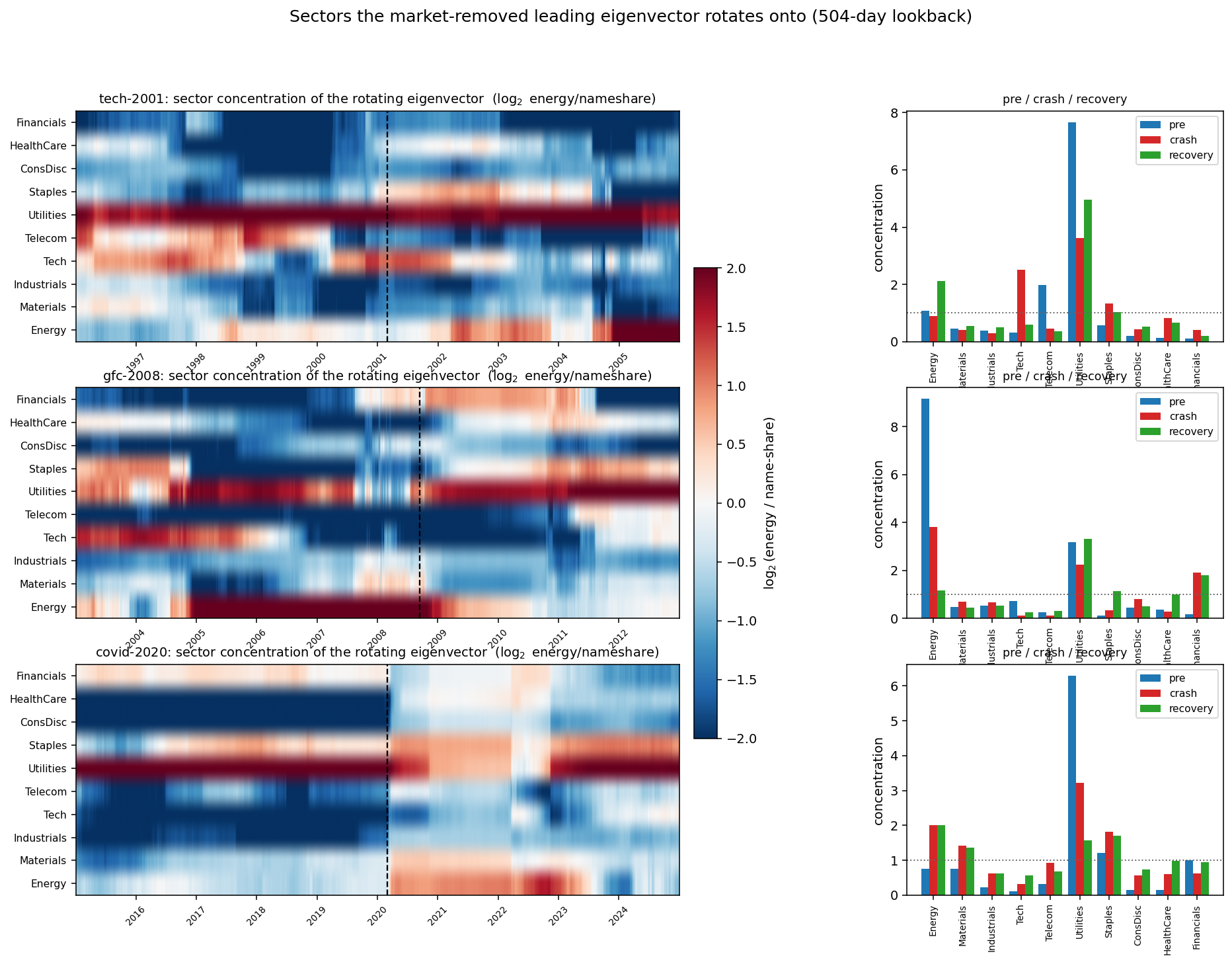
The ‘market’ eigenvector direction remains stable across crises; it is the leading sectoral mode that rotates. This rotation is coherent (i.e., much less than random-subspace drift), with distinct sectoral composition identifying each crisis: Figure 6

Figure 6: Eigenbasis rotation diagnostics — market direction is stable, but sectoral leading eigenvectors exhibit coherent rotation at crises.

Figure 7

Figure 7: Sector composition and concentration of the rotating market-removed leading eigenvector, pinpointing crisis identities (e.g., energy in 2008, utilities in Covid).

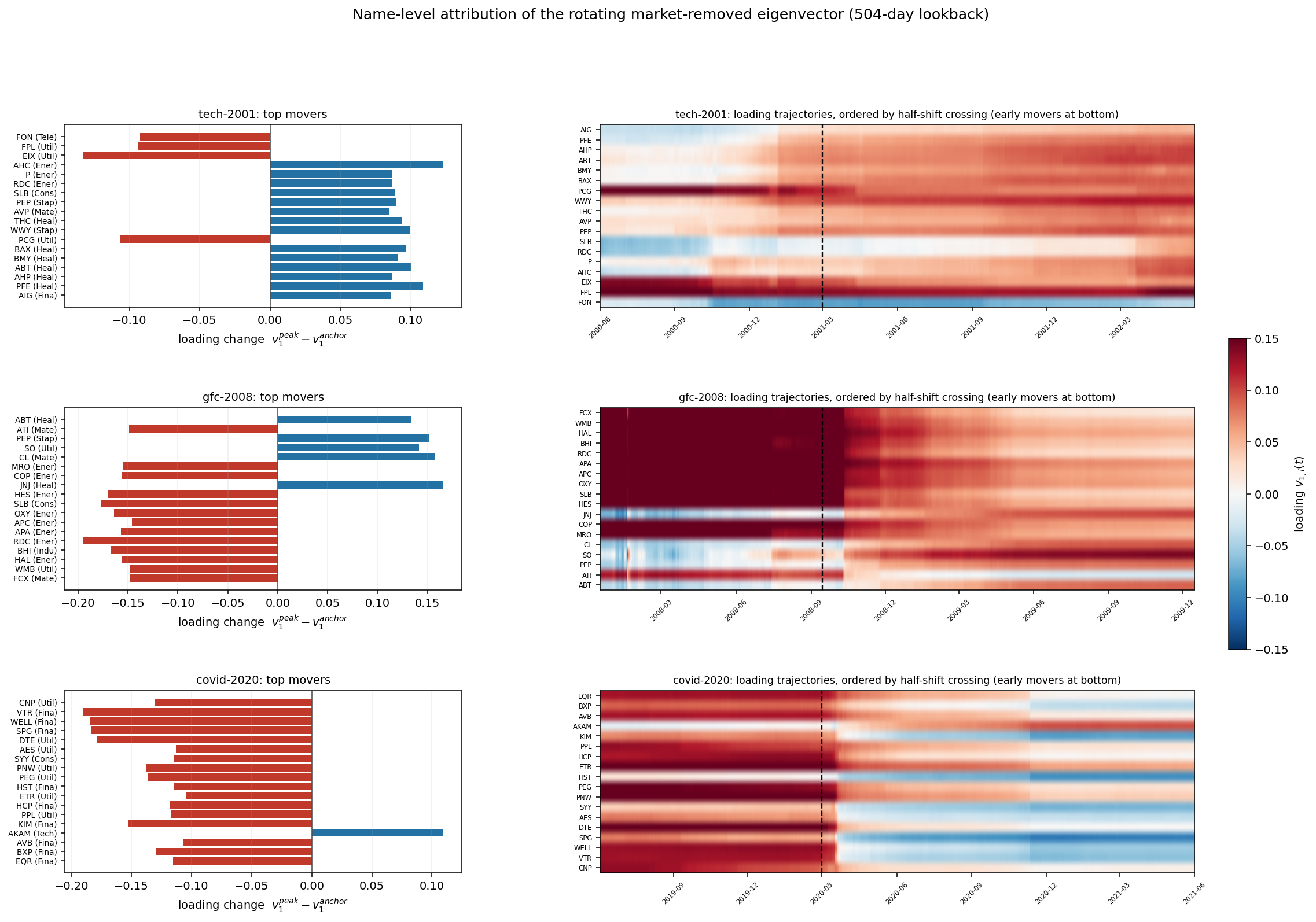
The name-level analysis resolves the order, synchronization, and drivers of these rotations, with strong correspondence between sectoral movers and the forecastability of endogenous versus exogenous events. Figure 8

Figure 8: Name-level attribution of loading changes, quantifying which stocks reorient most at crisis onsets and their temporal synchronization.

Ranking Chains: Mixing, Entropy, and Irreversibility

Ranking-based Markov chains (for return and volatility orderings) provide a market-neutral, complementary tool:

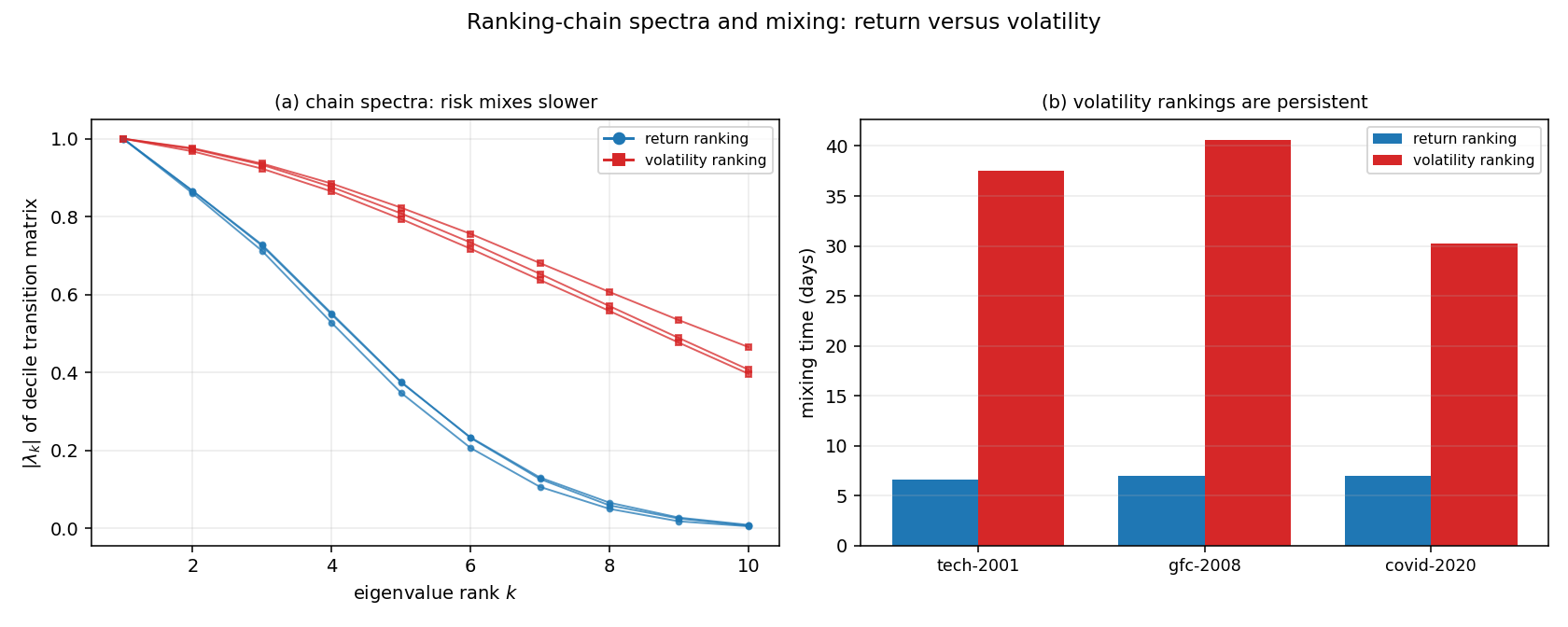
  • Return chains: Moderate persistence (mixing time ~1 week), persistent sectoral leaders/laggards, nearly reversible dynamics (low entropy production).
  • Volatility chains: High persistence (mixing time ~1 month), led by financials, episodic but significant time-irreversibility at stress events, aligning with the Zumbach effect. Figure 9

    Figure 9: Spectra and mixing timelines of Markov chains, measuring order persistence and volatility clustering.

    Figure 10

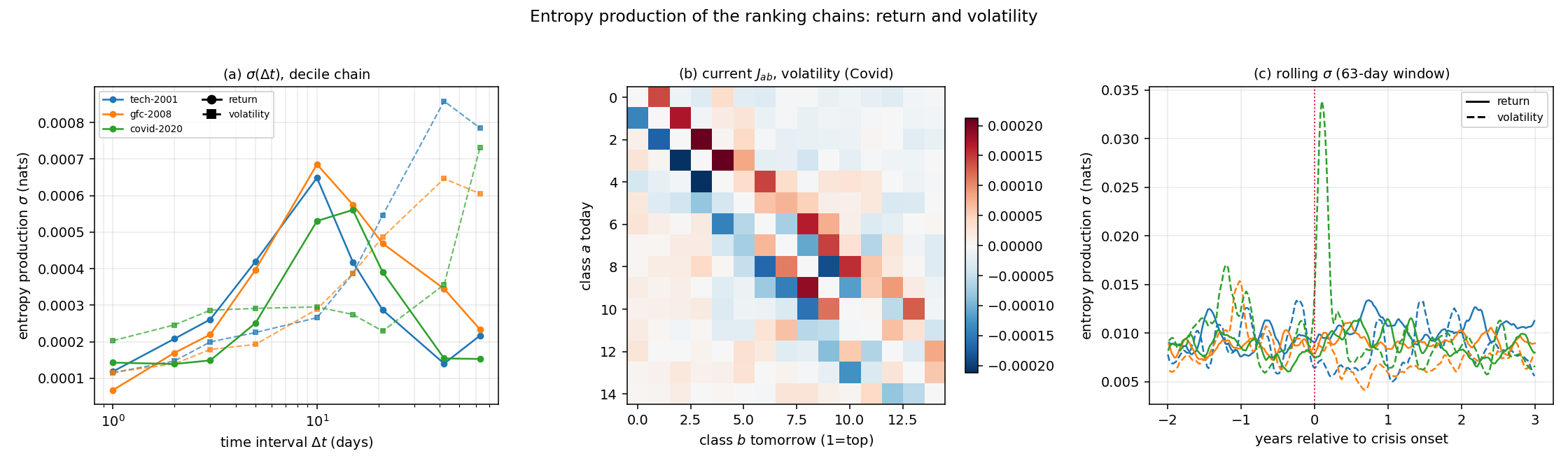
    Figure 10: Entropy production in ranking chains, with only volatility displaying significant irreversibility at periods of market stress.

Time-resolved entropy production diagnostics demonstrate:

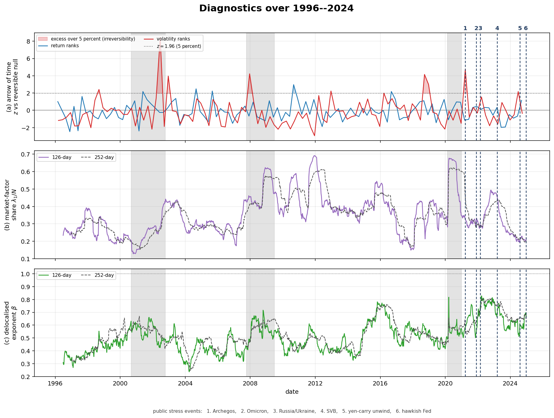
  • Volatility ranking is essentially reversible in stable periods, but flares (z48z\sim 4-8) in response to sustained crises (2002, 2008), matching irreversible volatility clustering rather than brief symmetrical shocks.
  • The return ranking never accumulates irreversibility, consistent with weak time-reversal asymmetry at the level of returns. Figure 11

    Figure 11: Time-resolved entropy production “arrow of time” quantifying market irreversibility; strong in volatility during crises, absent for return ordering.

Transfer entropy analysis uncovers directed sectoral and name-level information flow:

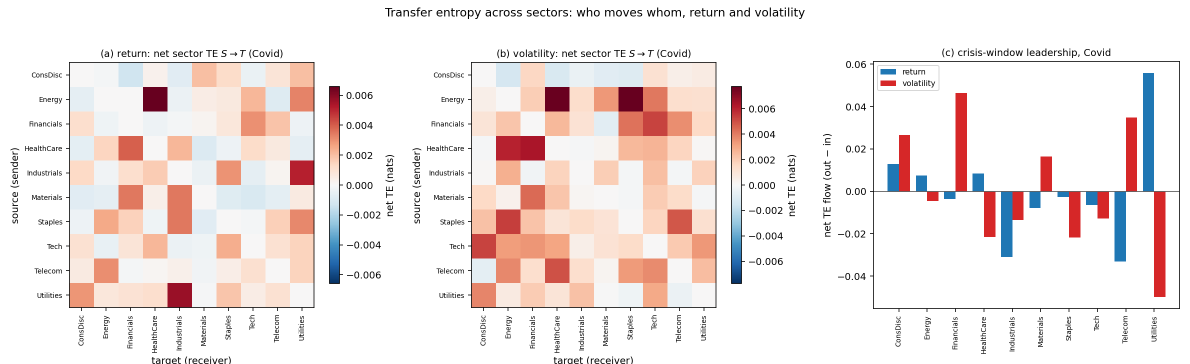
  • Utilities and defensives are leading indicators in return ranking during crises (flight to quality); financials lead in the volatility channel during financial distress. Figure 12

    Figure 12: Net transfer entropy between sectors for return and volatility orderings, revealing crisis-phase leadership reversals.

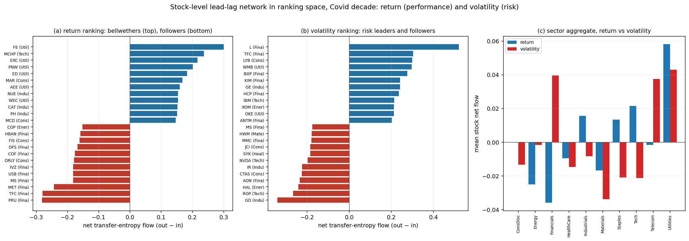
    Figure 13

    Figure 13: Name-level lead-lag network; transfer entropy pinpoints bellwethers and followers in both risk and performance channels.

Crash Anatomy: Co-movement and Dispersion

Crash diagnostics are twofold:

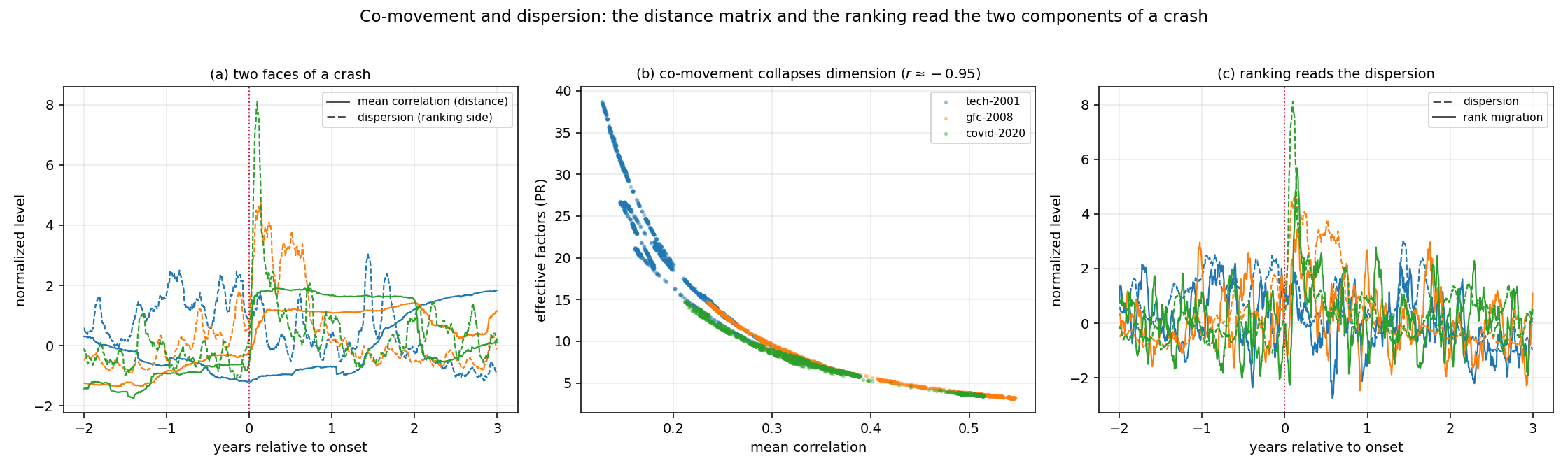
  • Distance matrix: Elevated co-movement (mean correlation), contraction of effective dimension.
  • Ranking chain: Enhanced cross-sectional dispersion and migration rate. Figure 14

    Figure 14: Simultaneous rise in co-movement and dispersion at crashes, tightly coupled in their dynamics.

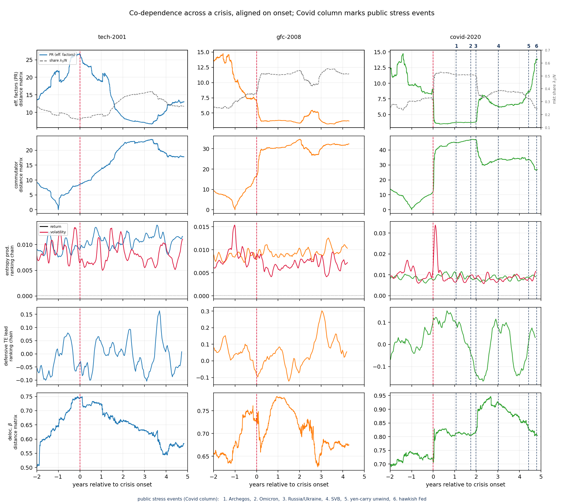
Joint dynamics across crises show coupled but temporally staggered diagnostic responses: spectral collapse occurs at crash onset; market-neutral ranking-based indicators (entropy production, transfer-entropy leadership) rise more gradually post-event. Figure 15

Figure 15: Co-evolution of spectral, geometrical, and ranking-based diagnostics, highlighting time lag between correlation collapse and ranking chain response.

Implications and Theoretical Insights

Empirical Contradictions to Low-Rank or Manifold Learning in Market Geometry

Unlike machine learning systems or relaxed physical models, financial cross sections fail to develop or retain a low-dimensional manifold structure, maintaining persistent high-dimensional spectral signatures and never approaching the BBS equilibrium regime. The distance matrix remains an unrelaxed, dynamically evolving object throughout crises and recovery; this underscores the appropriateness of non-equilibrium statistical mechanics descriptions (possibly NESS) for markets.

Conditional Early Warning and Forecastability

Fragility signals (rising mean correlation, falling participation ratio) only provide early warning for endogenously building crises, not for exogenous events or decorrelated unwinds. Name-level synchronization in sectoral eigenvector rotation matches the presence or absence of predictability.

Practical Uses and Extensions

Diagnostics from distance matrices and ranking chains offer potential for:

  • Dynamic covariance and risk modeling: the matrix-based observables can serve as state variables in regime-sensitive optimization and risk management.
  • Enhanced regime recognition: conditionality in diagnostic response to types of shocks or crises.
  • Stochastic portfolio theory: integration of transfer entropy and ranking stationarity for dynamic allocation.

Further research is directed toward the incorporation of exogenous covariates into ranking-chain dynamics and the real-time cointegration of correlated diagnostic signals for portfolio management.

Conclusion

This study delivers an integrated matrix-based framework for real-time and historical monitoring of market dynamics, revealing that financial markets, as measured by rolling distance matrices and ranking-based Markov chains, retain high-dimensional, non-equilibrium geometries even during rapid and profound regime transitions. Market crises manifest as dimensional collapse and coherent sectoral rotations—but without the geometric phase transitions characteristic of learning systems. Entropy- and information-theoretic analysis of ranking dynamics uncovers the non-equilibrium signatures of risk clustering and identifies sectoral hierarchy in crisis propagation. These results have substantial implications for market modeling, risk estimation, and future AI-driven financial decision-making.

Paper to Video (Beta)

No one has generated a video about this paper yet.

Whiteboard

No one has generated a whiteboard explanation for this paper yet.

Explain it Like I'm 14

Explaining “Observable Matrix Dynamics of Stocks” for a 14-year-old

What this paper is about

This paper looks for a simple, reliable way to watch how the stock market changes over time. Instead of staring at thousands of numbers, it turns the market into a few fixed-size “matrices” (think: neatly arranged grids of numbers) that can be tracked day by day. The author tests this idea on the S&P 500 across three big market shocks:

  • The dot-com bust (around 2001)
  • The global financial crisis (2007–2008)
  • The Covid crash (2020)

The goal is to see:

  • How the market becomes more or less “tightly linked”
  • Which groups of stocks move together
  • Whether there are early warning signals before a crash
  • How “risk” behaves differently from “returns”

The main questions in simple terms

To make it easy to follow, here are the paper’s key questions:

  • Can we pack the market’s daily ups and downs into a few fixed-size pictures (matrices) that are easy to compare over time?
  • Do these pictures show the market “shrinking” to one big crowd move during crises?
  • If we remove the effect of “everything moving together,” can we see which sectors (like tech, energy, or utilities) are really leading or lagging?
  • Can we spot signs that a crisis is building ahead of time?
  • Do return rankings and risk rankings behave differently, and do they tell us anything about the “arrow of time” (whether market motion looks different forwards vs. backwards)?

How they studied it (with plain-language analogies)

The paper uses three matrix “views” of the market. Think of each as a different camera angle filming the same game.

  1. A map of angles between stocks (the “distance matrix”)
  • Each stock’s recent returns are compared to every other stock’s returns.
  • If two stocks often move the same way, the “angle” between them is small (they’re close). If not, the angle is big (they’re far).
  • This gives a fixed-size map of all pairwise distances, updated every day with a rolling window (for example, the last 2 years of data).

What they read from this:

  • Market factor: one giant “everyone moves together” direction. If this gets big, it means the market is moving in sync.
  • Effective number of factors (participation ratio): how many independent “directions” the market has. Fewer means everything is moving more alike (more crowded).
  • Spectrum: like the “notes” in the market’s music. How these notes spread out or clump together tells you about structure and change.
  • They also use two tools to see if directions themselves rotate over time:
    • Projector drift: how much the top directions have turned compared to a calm reference day.
    • Commutator norm: a measure that jumps when today’s market structure no longer lines up with the earlier one. Bigger means more reorganization.
  1. A ranking game for returns (performance)
  • Each day, rank all stocks by how well they’ve done recently.
  • Watch how stocks move between rank “buckets” day to day.
  • This creates a transition matrix (like a scoreboard of how often you move from, say, the top 10% to the middle 30%, etc.).
  • From this, you can see persistence (do leaders stay leaders?) and whether the forward and backward flows look the same (time-reversibility).
  1. A ranking game for volatility (risk)
  • Same idea as returns, but now rank by how “bouncy” (volatile) each stock is.
  • This transition matrix turns out to be stickier (more persistent) than returns—matching the well-known fact that volatility tends to “cluster.”

Extra concepts explained simply:

  • Lookback window: how long your memory is (e.g., last 6 months vs. last 2 years). Short windows react faster but are noisier; long windows are smoother but can hide fast changes.
  • Removing the market factor: imagine muting the loudest instrument (the overall market move) so you can hear which sections of the orchestra (sectors) are actually changing.

What they found (and why it matters)

  1. Crashes compress the market—except the dot-com bust
  • In 2008 and 2020, stocks moved much more in sync. The “market factor” got bigger, and the “effective number of directions” fell. This is like many voices merging into one loud chant.
  • In 2001, the opposite happened: the market split apart (dispersion). Tech moved away from the rest. So not all crises look the same.

Why this matters: It helps tell a “correlated crash” (everyone dives together) from a “dispersion event” (some fall, others don’t), which is critical for risk management.

  1. Shorter memory spots earlier tremors
  • Using shorter windows (like 6 months) captured sharper signals and even early hints before the 2008 crisis (a tremor in mid-2007). Longer windows smoothed these out.

Why this matters: If you want early warnings, shorter windows help—if you can handle more noise.

  1. The market never “learns” a stable shape
  • In machine learning, a system often settles into a neat, low-dimensional structure as it learns. The market didn’t do that. A key slope number (called beta) stayed around 0.7 and never showed the telltale signs of “settling.”
  • Translation: the market keeps changing and doesn’t relax into a simple, steady pattern.

Why this matters: Don’t expect the market’s structure to become stable. It behaves like a living, non-equilibrium system.

  1. Removing the “everyone together” move reveals sector rotations
  • After muting the market factor, a clear rotation shows up:
    • Utilities often form a persistent, tight-knit block.
    • Tech was central around 2001.
    • Energy dominated the 2003–2012 period and returned as a leader after 2020.
    • Real estate investment trusts (REITs) and utilities moved together strongly in early Covid.
  • The timing of these rotations didn’t always match the main crash dates. For Covid, the sector reshuffling continued long after the initial plunge.

Why this matters: It shows who is really leading or lagging beneath the surface—useful for portfolio shifts.

  1. The main market direction stays; sectors do the turning
  • The top “everyone together” direction remained almost the same during crises—its strength changed, not its direction.
  • The biggest rotations happened in the sector layer underneath. The commutator measure jumped right at crisis onset, confirming a sudden reorganization.

Why this matters: The dramatic action is in how sectors re-arrange, not in the overall market direction.

  1. Name-level details tell who moved first—and which crises were predictable
  • By tracking the top-changing individual stocks, the paper shows:
    • 2020 was synchronized: many rate-sensitive names (REITs, utilities) moved together at once—typical of an external shock (a pandemic).
    • 2001 was staggered: some groups moved months early—typical of a slow unwind.
    • 2008 re-shaped more gradually across 2008–2010.
  • Early warning worked for 2008 (built from inside the system) but not for 2020 (a sudden outside shock) and not for 2001’s dispersion.

Why this matters: You can sometimes predict crises that build internally (like 2008), but not sudden outside shocks (like 2020).

  1. Ranking chains: returns vs. risk behave differently
  • Return rankings: somewhat stable with leaders that last a bit, and mostly time-reversible (playing the movie backward looks similar).
  • Volatility rankings: much more persistent and show a weak “arrow of time” that lights up during stress. This matches known effects like volatility clustering and the Zumbach effect (volatility today relates to past return direction).
  • During crises, defensive sectors tend to lead in information flow.

Why this matters: Risk behaves differently from returns and can be a better stress gauge during turmoil.

  1. Different shocks leave different fingerprints
  • Archegos (2021): strong “arrow of time” in the volatility ranking (directional deleveraging).
  • Silicon Valley Bank (2023): big correlation shift (spectral concentration).
  • Short-lived, symmetric shocks: little footprint.

Why this matters: The type of signal that moves can help you identify what kind of shock you’re dealing with.

What this means going forward

  • For investors and risk managers:
    • Use a multi-matrix dashboard: watch correlation concentration, sector rotations (after removing the market factor), and the volatility ranking’s time arrow.
    • Shorter windows can give earlier hints but require care with noise.
    • Don’t expect to predict sudden outside shocks from inside-the-market signals.
    • Track sector and name-level rotations to know who is driving a move and in what order.
  • For researchers and tool builders:
    • The market looks like a non-equilibrium system that doesn’t settle into a low-dimensional shape.
    • There’s room to improve the estimates with bigger universes, longer histories, better noise cleaning, and adding extra information (like sectors or company traits) to the ranking chains.

In one sentence: The paper shows how to turn the messy daily market into a few clear, fixed-size “pictures” that reveal when the market moves as one, how sectors rotate underneath, which crises can be anticipated, and how risk behaves differently from returns—especially in turbulent times.

Open Problems

We haven't generated a list of open problems mentioned in this paper yet.

Tweets

Sign up for free to view the 1 tweet with 0 likes about this paper.