- The paper introduces a framework that integrates interaction effectiveness, user experience, and system efficacy for assessing healthcare dashboards.
- It employs a hybrid deductive-inductive approach based on an integrative review of 81 studies to refine dashboard definitions and identify seven evaluation scenarios.
- The framework’s case study on a COVID-19 dashboard demonstrates iterative design improvements and actionable insights for optimizing user interactions and system performance.
A Comprehensive Framework for Evaluating Healthcare Dashboards
This paper presents a systematic framework for evaluating dashboards in healthcare, addressing the lack of consistent and comprehensive approaches in the literature. The authors conduct an integrative review of 81 empirical studies, propose a refined definition of dashboards as visual information systems, and introduce seven evaluation scenarios grouped under three themes: interaction effectiveness, user experience, and system efficacy. The framework is demonstrated through a case study involving iterative design and evaluation of a COVID-19 dashboard.
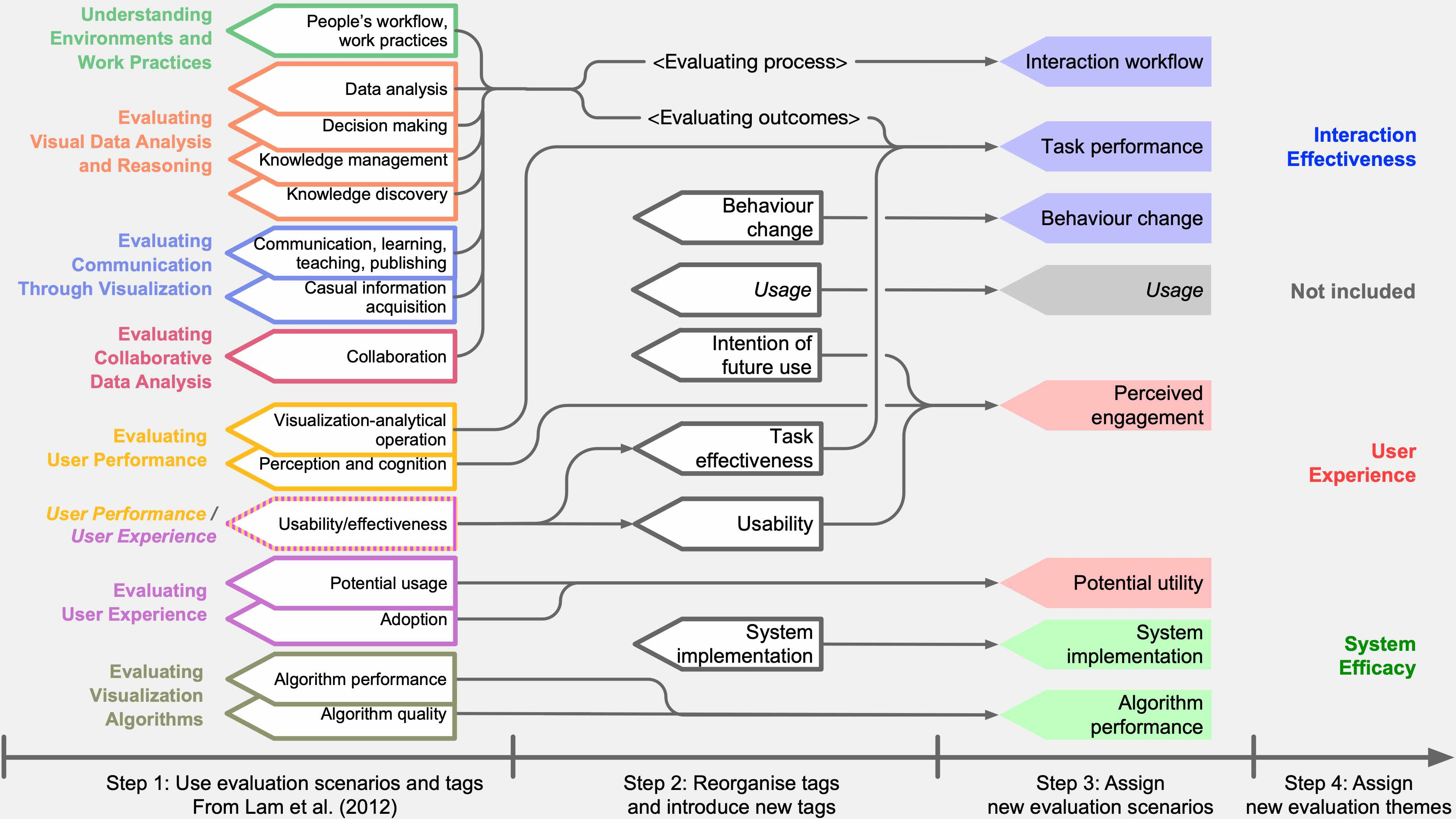
Figure 1: The development of evaluation scenarios in this study, illustrating the coding process and consolidation of tags into evaluation scenarios and themes.
Dashboard Definition and Theoretical Positioning
The paper advances the definition of dashboards beyond simple visual displays, positioning them as visual information systems designed to fulfill precise information needs. This definition emphasizes the integration of data, visual figures, and a GUI that adapts to data changes or user interactions. The distinction between dashboards and information visualization systems is clarified: dashboards serve as ecosystems for integrating visualizations to expose relevant data, rather than as tools for designing visualizations themselves.
The authors argue that evaluation should not be limited to intended tasks but must also consider user outcomes, including indirect effects on broader user groups and organizational processes. This holistic perspective is a key novelty of the framework.
Methodology: Literature Review and Coding Schema
A systematic literature review was conducted using IEEE, ACM, Google Scholar, and PubMed, yielding 81 relevant publications after rigorous screening. The coding schema was developed through a hybrid deductive-inductive approach, starting from Lam et al.'s seven scenarios for information visualization evaluation and extending them with new tags relevant to healthcare, such as behavior change and system implementation.
The coding process involved multiple rounds of discussion and tag reorganization, resulting in seven evaluation scenarios grouped into three themes:
- Interaction Effectiveness: Interaction Workflow, Task Performance, Behavior Change
- User Experience: Perceived Engagement, Potential Utility
- System Efficacy: System Implementation, Algorithm Performance
Evaluation Scenarios: Definitions, Measures, and Challenges
Interaction Effectiveness
- Task Performance (TP): Assesses dashboard impact on task outcomes using quantitative metrics (accuracy, time, actions). Challenges include task selection and aggregation of sub-task performance.
- Behavior Change (BC): Evaluates long-term changes in user behavior attributable to dashboard use. Measurement is difficult due to causality and time-lag issues.
- Interaction Workflow (IW): Examines intuitiveness and efficiency of user interaction patterns. Data is collected via logs, observation, and interviews; challenges include user variance and modeling interaction sequences.
User Experience
- Perceived Engagement (PE): Captures subjective user feedback on usability, aesthetics, and satisfaction, typically via standardized questionnaires (e.g., SUS, CSQU). Data collection is obtrusive and may interrupt natural interaction.
- Potential Utility (PU): Identifies possible future functions and secondary tasks through self-reported methods. Effective follow-up and abstraction of user suggestions are critical.
System Efficacy
- Algorithm Performance (AP): Evaluates accuracy and efficiency of embedded algorithms using standard metrics (AUC, F-measure). Limited in scope; does not capture holistic dashboard quality.
- System Implementation (SI): Assesses fit to the working environment, including hardware, data presentation, and support. Data is typically collected from domain experts; feedback may be inconsistent.
Case Study: Iterative Design of a COVID-19 Dashboard
The framework was applied to the design and evaluation of a public-facing COVID-19 dashboard for England, focusing on three scenarios: IW, PE, and PU. The dashboard aimed to communicate epidemiological concepts, monitor key performance indicators across FTTIS stages, and serve as a data hub.
Iterative weekly design changes were guided by scenario-specific questions, leading to improvements in layout, color coding, information density, and interactive features. Key issues identified included information overload, lack of background context, and challenges in interpreting complex visualizations (e.g., Sankey diagrams). Solutions involved simplifying visual encoding, reorganizing information, and enhancing user guidance.
(Figure 2)
Figure 2: Illustrations of main visual changes in the COVID Response Evaluation Dashboard, showing progressive simplification and improved user guidance.
(Figure 3)
Figure 3: Final version of the COVID Response Evaluation Dashboard, with streamlined summary and detailed interactive data exploration.
Discussion: Implications and Recommendations
The framework provides a structured approach for comprehensive dashboard evaluation, emphasizing the need to consider multiple scenarios and their interplay. The authors recommend:
- Employing diverse evaluation scenarios for holistic assessment.
- Leveraging established criteria and measures from prior studies.
- Designing dashboards to guide user attention and facilitate intended tasks.
The framework is generalizable beyond healthcare, with potential applicability in other domains where dashboards serve complex, multi-user environments.
Comparison to Existing Frameworks
The proposed framework extends prior work by Lam et al. and others, incorporating new scenarios relevant to healthcare and focusing on both interaction processes and outcomes. Unlike previous definitions, it does not attempt to specify all dashboard functions but instead provides a flexible structure for evaluation across evolving use cases.
Limitations and Future Directions
The review is limited to published empirical studies, potentially missing industry practices. The framework is currently grounded in healthcare but is intended for broader application. Future work should involve direct feedback from industry practitioners and further refinement across domains.
Conclusion
This paper introduces a comprehensive framework for evaluating healthcare dashboards, grounded in a systematic review and refined coding schema. Seven evaluation scenarios grouped under three themes provide a robust structure for assessing dashboard quality, guiding both design and post-deployment evaluation. The framework is demonstrated through a real-world case study, highlighting its practical utility and adaptability. Future research should focus on extending the framework to other domains and integrating industry feedback for further refinement.